Adaptive vs. Responsive UI: Which One Should You Use and When?
Introduction
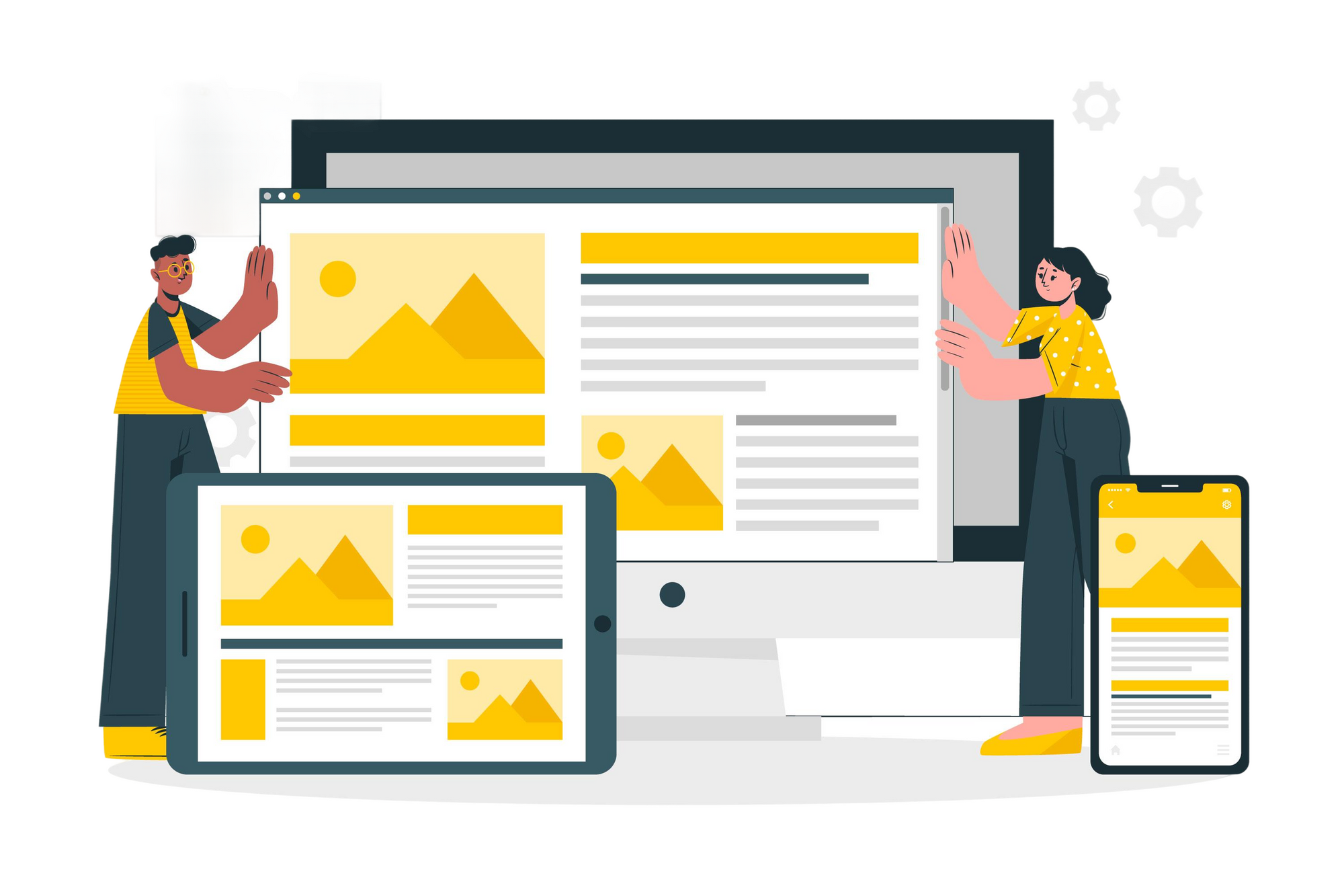
When designing user interfaces for multiple devices, one of the key decisions you’ll face is whether to use responsiveor adaptive design. Both approaches aim to provide a seamless experience across screen sizes, but they differ in how they achieve that goal. Understanding the strengths and trade-offs of each will help you make smarter design choices based on your project's needs, performance expectations, and user behavior.
In this blog, we’ll unpack the differences between adaptive and responsive UI, explore real-world use cases, and help you decide which approach suits your next digital product best.
What is Responsive Design?
Responsive design creates a single layout that flexibly adjusts to different screen sizes using fluid grids, relative units (like %, em, rem), and media queries. Content automatically resizes and reflows to fit the available viewport.
Key Characteristics
- Fluid, flexible layouts
- One codebase with CSS media queries
- Content scales smoothly from small to large screens
Pros
- Easier to maintain (single layout)
- Consistent user experience
- Ideal for content-rich websites and blogs
Cons
- Can be slower to load on mobile (unoptimized assets)
- May not perfectly tailor UX for specific devices
- Requires careful planning of breakpoints and content hierarchy
What is Adaptive Design?
Adaptive design uses multiple fixed layouts designed for specific screen sizes. When a user accesses the site or app, the system detects the device and serves the layout designed for that screen size.
Key Characteristics
- Multiple layouts for different screen widths
- Device detection and targeted rendering
- Optimized UX per device
Pros
- Highly tailored experiences for different devices
- Faster loading on each device (only relevant layout loads)
- More control over UI behavior on specific platforms
Cons
- Higher development and maintenance cost
- More code and assets to manage
- May miss out on future, in-between screen sizes
Key Differences at a Glance
| Feature | Responsive UI | Adaptive UI |
|---|---|---|
| Layout Flexibility | Fluid, dynamic | Fixed, device-specific |
| Performance | Moderate | Can be faster |
| Maintenance | Easier (one layout) | Harder (multiple layouts) |
| User Experience | Consistent across all devices | Tailored to specific devices |
| Scalability | Great for unknown/new devices | Limited to predefined breakpoints |
| Development Effort | Lower upfront effort | Higher complexity |
When to Use Responsive UI
Responsive UI is the default standard in modern web design. It works best when:
- You’re targeting a wide range of devices with varying screen sizes
- You want a consistent experience with minimal layout-specific logic
- You’re building content-heavy platforms like blogs, news sites, or portfolios
- You have limited development resources and want a single codebase
Example Use Cases
- News websites (e.g., BBC, Medium)
- Corporate websites
- SaaS dashboards
When to Use Adaptive UI
Adaptive UI is ideal when performance, platform-specific experience, or brand control is a top priority. Use it when:
- You want pixel-perfect control on specific devices
- You’re optimizing for high conversion (e.g., e-commerce, fintech)
- Speed is critical, and you need to deliver only relevant resources
- You’re working on native apps or hybrid experiences
Example Use Cases
- E-commerce giants like Amazon
- Custom enterprise tools
- Apps with strict design differences between mobile and desktop
Can You Combine Both?
Yes. In fact, many modern digital products use a hybrid approach:
- Start with adaptive templates for major screen categories (mobile, tablet, desktop)
- Use responsive techniques within each template to accommodate minor variations
This allows you to balance performance with flexibility, offering tailored experiences while still scaling across new devices.
Real-World Examples
1. Responsive: Airbnb Website
Airbnb uses responsive design to maintain a seamless experience across devices, with consistent visuals and content prioritization.
2. Adaptive: Apple Website
Apple’s site serves different layouts depending on device, offering optimized performance and visuals tailored to mobile, tablet, and desktop.
Final Thoughts
Choosing between adaptive and responsive UI isn't about right or wrong—it’s about what’s right for your users and your product goals. If your audience is broad and unpredictable, responsive is usually the best bet. If you need surgical control over the user experience on specific devices, adaptive is worth the extra investment.
Ultimately, great UI design is about intentionality. Choose your approach with care, test thoroughly across devices, and let your users guide the final decision.