Designing for Accessibility: Why Inclusive UI is Non-Negotiable
Introduction
Accessibility in design is not just a feature—it's a fundamental human right. As digital products become increasingly integral to our daily lives, ensuring that everyone, regardless of their abilities or disabilities, can use them effectively is non-negotiable. Inclusive UI design isn’t just about compliance—it’s about creating equal opportunities and experiences for all users.
This blog explores the importance of accessible design, key principles to follow, and actionable strategies to build inclusive interfaces that truly serve everyone.
What is Accessibility in UI/UX?
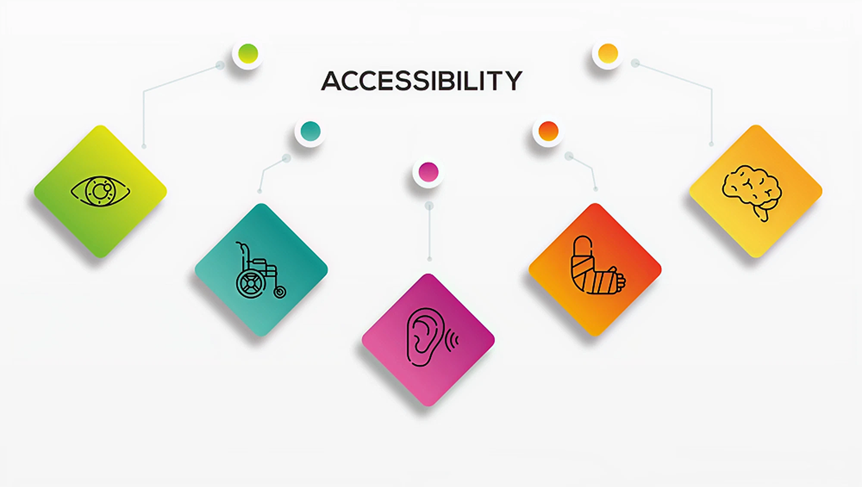
Accessibility in UI/UX refers to designing digital interfaces and experiences that can be used by people with a wide range of abilities and disabilities. This includes users who are:
- Blind or visually impaired
- Deaf or hard of hearing
- Experiencing cognitive or learning disabilities
- Physically impaired or using assistive technologies
Accessibility ensures that digital tools are usable, perceivable, operable, and understandable by all.
Why Inclusive Design is Non-Negotiable
1. It’s a Human Right
Everyone deserves equal access to information, services, and opportunities. Designing accessible products upholds the dignity and independence of all users.
2. It Expands Your Reach
According to the World Health Organization, over 1 billion people live with some form of disability. Inclusive design broadens your audience and improves the usability of your product for everyone.
3. It’s Legally Required
Many countries have regulations (like ADA, WCAG, and EN 301 549) that require digital accessibility. Non-compliance can result in legal action and reputational damage.
4. It Enhances User Experience
Accessibility improves UX for all users—not just those with disabilities. Features like better contrast, larger click targets, and clear navigation help everyone.
Key Principles of Accessible Design (WCAG Guidelines)
1. Perceivable
Users must be able to perceive the information being presented.
- Use alt text for images
- Provide captions for videos
- Ensure sufficient color contrast
2. Operable
Users must be able to navigate and interact with the interface.
- Enable full keyboard navigation
- Avoid time-limited tasks without warning
- Provide clear focus indicators
3. Understandable
Users must be able to understand the content and interface.
- Use plain language
- Offer consistent navigation
- Provide helpful error messages
4. Robust
The content must be compatible with current and future assistive technologies.
- Use semantic HTML
- Follow ARIA (Accessible Rich Internet Applications) standards
- Test with screen readers and other tools
Practical Tips for Designing Inclusive UI
1. Design for Keyboard Navigation
Ensure all interactive elements can be accessed using the keyboard (Tab, Enter, Arrow keys). Include visible focus states to indicate where the user is.
2. Use Sufficient Color Contrast
Text and interactive elements should have a contrast ratio of at least 4.5:1. Tools like WebAIM's Contrast Checker can help you validate this.
3. Provide Text Alternatives
Use meaningful alt text for images, and include screen reader-friendly labels for icons and buttons.
4. Avoid Relying on Color Alone
Color should not be the only means of conveying information. Use shapes, labels, or textures to provide additional cues.
5. Make Interactive Elements Large Enough
Buttons and links should be easy to tap or click. WCAG recommends a minimum touch target size of 44x44 pixels.
6. Support Zoom and Scaling
Ensure your UI remains functional and legible when users zoom in or adjust text size.
7. Write Accessible Copy
Keep language clear and concise. Avoid jargon. Use descriptive headings and logical content structure.
8. Use ARIA Roles Wisely
Use ARIA roles and properties to enhance screen reader compatibility, but don't rely on them as a substitute for semantic HTML.
9. Design Error States Thoughtfully
Use clear language, highlight the specific fields with issues, and provide actionable guidance to correct them.
10. Test with Real Users and Tools
Use screen readers (like NVDA or VoiceOver), keyboard-only navigation, and accessibility evaluation tools like WAVE or Axe. Where possible, include users with disabilities in your testing process.
Tools and Resources for Accessibility
- WAVE Accessibility Tool
- WebAIM Contrast Checker
- Google Lighthouse
- NVDA (Screen Reader for Windows)
- VoiceOver (Screen Reader for macOS/iOS)
- WCAG Guidelines (W3C)
Real-World Examples of Inclusive Design
1. Apple
Apple’s products come with built-in accessibility features such as VoiceOver, AssistiveTouch, and custom display settings, making them usable for people with various disabilities.
2. Microsoft
Microsoft’s Inclusive Design Toolkit provides resources for designing accessible digital experiences. Their products include screen readers, closed captions, and high-contrast modes.
3. LinkedIn
LinkedIn redesigned their mobile and web apps to meet WCAG 2.1 standards. They focused on contrast ratios, keyboard support, and screen reader compatibility.
Conclusion
Designing for accessibility is not just about compliance—it's about empathy, responsibility, and good design. By prioritizing inclusive design principles, you make your digital product better for everyone. Accessibility isn’t a checkbox; it’s a mindset that leads to more thoughtful, effective, and universal user experiences.
Inclusive UI is no longer optional. It's the foundation of ethical and user-centered design.