Designing for Thumbs: Mobile UX Best Practices
Introduction
In today's mobile-first world, users expect fast, seamless, and intuitive experiences at their fingertips—literally. According to Statista, over 60% of global website traffic now comes from mobile devices. This statistic alone makes it clear: if your mobile interface isn’t optimized for one-handed, thumb-driven use, you’re likely alienating a significant portion of your audience.
Designing for mobile isn't just about shrinking a website down to fit a smaller screen. It's about rethinking how people physically interact with their devices—especially with their thumbs. Thumb-friendly design is about comfort, accessibility, and speed—all critical aspects of modern mobile UX.
This blog explores the science of thumb usage, the psychology behind mobile interaction, and the practical UX principles that lead to more ergonomic and satisfying user experiences. Whether you're designing an app or optimizing a mobile website, this guide will help you make smarter decisions.
Why Thumbs Matter in Mobile UX
1. One-Handed Usage is the Default
Studies show that the majority of users interact with smartphones using only one hand, typically holding the phone in their dominant hand while using the thumb to navigate. This is especially true when users are on the move—walking, commuting, or multitasking.
2. The Ergonomics of the Human Hand
Your thumb has a natural range of motion, and straining it to reach top corners or edges can cause discomfort. Repeated strain, over time, can even lead to user fatigue or avoidance behavior. Interfaces that ignore this principle often see lower engagement rates and higher bounce rates.
3. Bad Thumb Design = High Friction
When users have to adjust their grip just to tap a button or navigate, that’s friction. Friction breaks flow. A well-designed mobile experience keeps users in flow by making all essential actions easy to reach and effortless to perform.
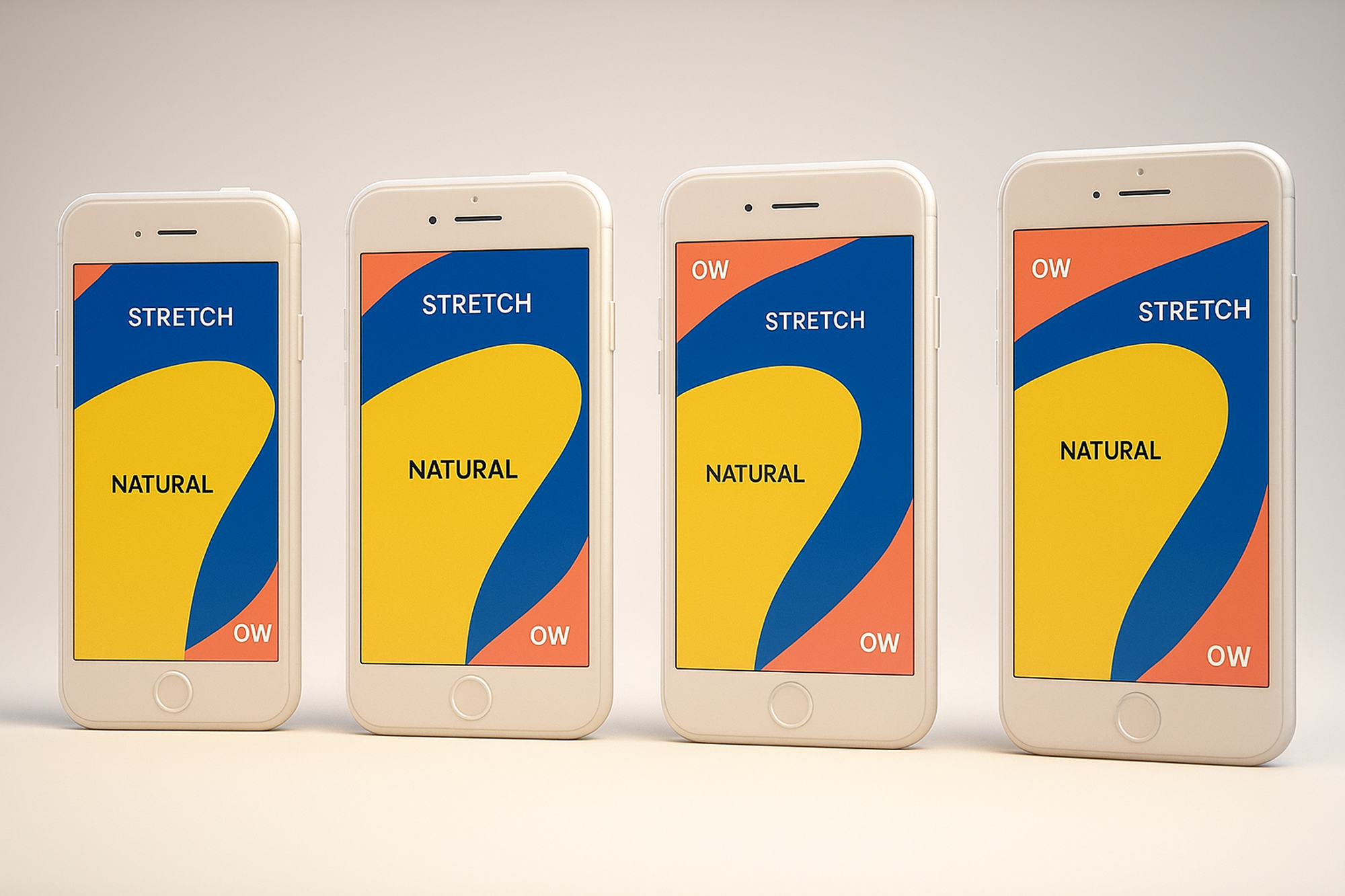
Mapping the Thumb Zone: Understanding Reachability
Steve Hoober's research introduced the concept of the "thumb zone"—a map of reachable areas on a mobile screen when a user holds the device in one hand. These zones are key to creating comfortable and intuitive mobile interfaces.
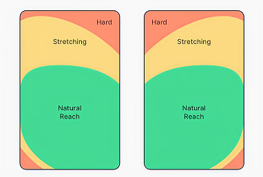
🟢 Easy Zone (Green Zone)
- Located in the bottom center and bottom left (for right-handed users)
- Ideal for key actions like navigation, primary buttons, floating action buttons (FABs), and thumb-gestures
🟡 Stretch Zone (Yellow Zone)
- The middle and upper-middle areas
- Suitable for secondary functions or informational content
🔴 Hard-to-Reach Zone (Red Zone)
- Top corners and upper edges
- Should be avoided for primary interactions or frequent tasks
Pro Tip: Left-handed users mirror this layout, so test across both orientations if possible.
Mobile UX Best Practices for Thumb-Friendly Design
1. Prioritize Bottom Placement for Primary Actions
Move your most important interactive elements (like CTAs, navigation tabs, and key buttons) into the thumb’s natural zone.
Examples:
- Place the “Add to Cart” button above the fold, but near the bottom.
- Stick your most important CTA to the bottom center of the screen.
2. Design Thumb-Optimized Navigation
Navigation should be easy to access without finger gymnastics.
- Use bottom nav bars with 3–5 clearly labeled icons
- Consider implementing swipeable tabs or gesture-based navigation
Avoid putting hamburger menus in the top-left corner unless it’s secondary.
3. Use Floating Action Buttons (FABs) Wisely
FABs are great for placing high-priority actions within immediate thumb reach. However, don't clutter the screen with too many of them, and make sure they don’t obstruct important content.
4. Increase Touch Target Sizes
Small, fiddly buttons are frustrating.
- Apple recommends 44x44px as the minimum tap size.
- Google Material Design recommends 48x48dp.
Add extra padding around buttons to reduce accidental taps and missed clicks.
5. Embrace Natural Gestures
Gestures like swiping, dragging, or long-pressing are more intuitive than top-mounted dropdowns.
- Use bottom sheet menus instead of modal dialogs
- Employ swipe actions (e.g., for deleting or archiving in lists)
Just ensure all gestures have clear visual cues or fallback options for discoverability.
6. Reimagine Forms and Input Fields
Mobile forms are one of the biggest UX challenges. Help users by:
- Auto-detecting input types (e.g., number pad for phone fields)
- Placing labels within easy reach
- Avoiding multi-column layouts
- Breaking long forms into smaller steps (progressive disclosure)
7. Reduce Cognitive Load with One-Tap Actions
Keep tasks simple and interaction flows minimal. Enable users to complete goals with as few taps as possible.
- Autofill data when possible
- Enable “tap to call,” “tap to pay,” or “tap to copy” shortcuts
8. Design for Context and Movement
Mobile users are often on the go. Design for:
- Quick interruptions
- One-handed use while walking
- Glare, distractions, and unstable environments
Use large fonts, high contrast, and legible spacing to ensure quick readability.
Real-World Examples of Thumb-Friendly UX
1. Instagram
- Main navigation and action buttons (like, comment, share) are placed at the bottom.
- Swipe gestures allow for effortless tab transitions.
2. YouTube Mobile
- Video controls and navigation tabs are within easy reach.
- Floating mini-players allow multitasking without full-screen commitment.
3. WhatsApp
- Chat, call, and camera icons are bottom-aligned.
- Quick reply and voice message buttons are easily thumb-accessible.
Testing Your Thumb Design
Use these methods to test if your UI passes the thumb-friendliness test:
1. Prototyping Tools
Figma, Adobe XD, and ProtoPie allow simulation of mobile gestures.
2. In-Person Usability Tests
Watch users hold and operate the app in different scenarios—sitting, standing, walking.
3. Real Device Testing
Use phones of various sizes. What works on an iPhone Mini may fail on a Galaxy Note.
Conclusion
Designing for thumbs is not a constraint—it’s an opportunity to improve comfort, speed, and satisfaction in mobile UX. By placing core actions where thumbs naturally fall, simplifying touch interactions, and removing physical strain from the experience, designers can craft products that feel effortless and elegant.
So next time you're building a mobile interface, remember: the thumb rules. Design for it, and your users will thank you with engagement, loyalty, and delight.