Lightning Dark and Ultra-Contrast Design: Accessibility-Forward, Ultra-Dark, and Bold Visual UIs
In recent years, dark mode has gone from a niche feature to a default design option across operating systems, apps, and websites. But the evolution doesn’t stop there—designers are now pushing further into lightning-dark and ultra-contrast design, crafting interfaces that prioritize accessibility, energy efficiency, and bold visual impact.
These new approaches aren’t just about aesthetics—they’re about making digital experiences clearer, more inclusive, and easier on the eyes in diverse environments.
The Rise of Dark and Ultra-Dark Interfaces
Dark mode became popular for two reasons: user comfort (reducing eye strain in low-light settings) and device efficiency (particularly on OLED screens). As adoption grew, users began to expect a dark option as standard.
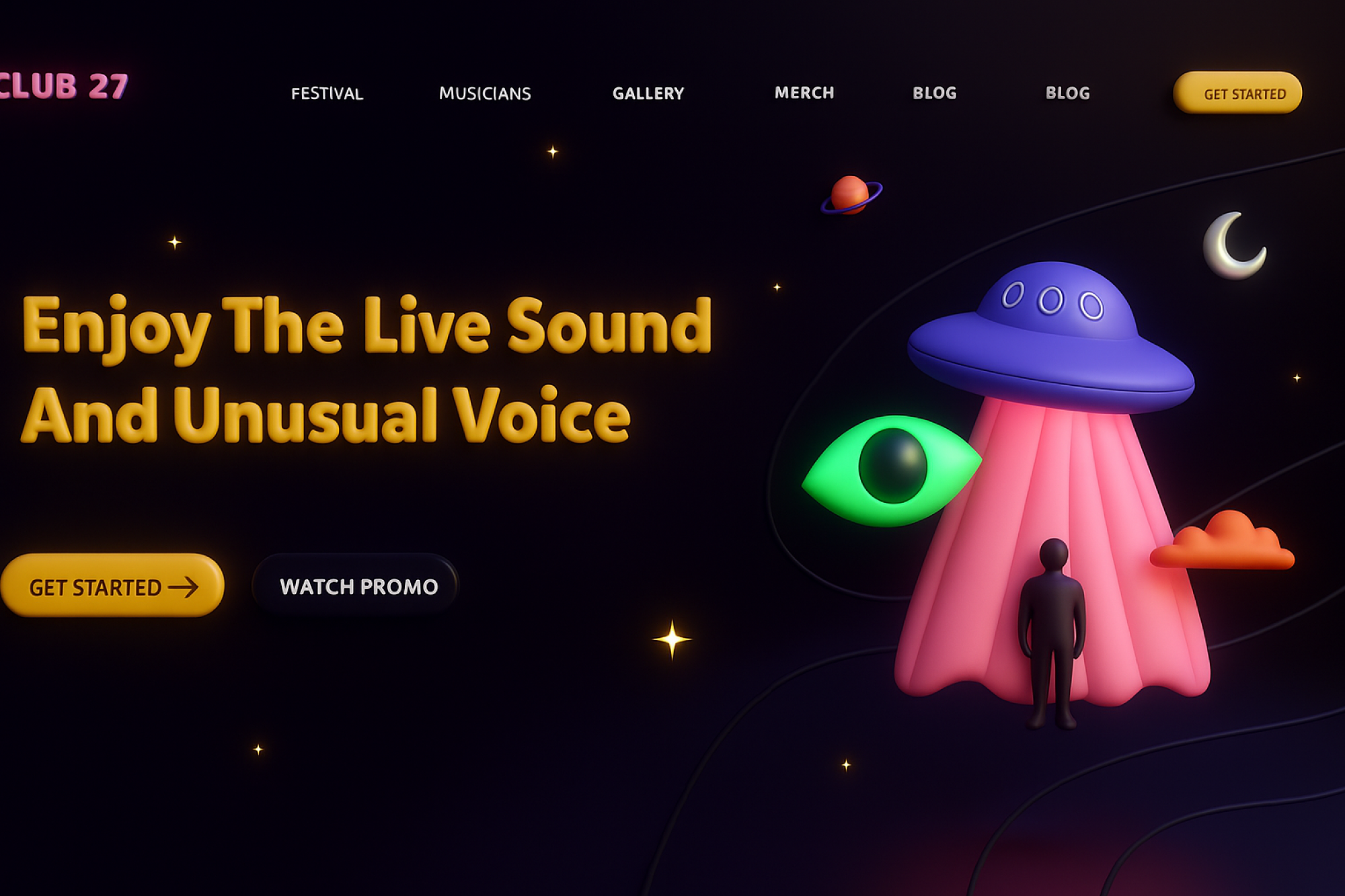
Lightning-dark design takes this further by embracing true blacks (#000000) and near-black tones, delivering crisp, high-contrast visuals. Meanwhile, ultra-contrast design amplifies readability by pairing deep blacks with bright, saturated highlights—creating interfaces that feel striking, futuristic, and inclusive.
Why Ultra-Dark and High-Contrast Matter
Accessibility
Ultra-contrast interfaces improve readability for users with visual impairments, color blindness, or age-related vision decline. WCAG guidelines emphasize contrast ratios for this very reason.
Eye Comfort & Focus
Darker backgrounds reduce glare and allow content (like text or media) to stand out, especially in low-light environments.
Energy Efficiency
On OLED and AMOLED displays, pure blacks mean pixels are switched off, extending battery life.
Aesthetic Boldness
High-contrast palettes create a sense of drama, clarity, and emphasis—perfect for portfolios, entertainment apps, or futuristic interfaces.
Principles of Lightning-Dark & Ultra-Contrast Design
Designing with darkness and bold contrast requires balance. Poorly executed, it can overwhelm or even harm accessibility. Here are key principles:
Prioritize Legibility
Use sharp, high-contrast text (e.g., pure white or light gray on black) while avoiding long passages of white text that cause eye fatigue.
Use Color Strategically
Bright accents (electric blues, neon greens, vibrant reds) pop against black but should be used sparingly to avoid clutter.
Leverage Depth and Shadows
Subtle shadows, gradients, and elevation effects add dimension and prevent flat black designs from feeling “dead.”
Accessibility Testing
Test designs for color blindness, low-vision users, and different environments. Ensure you meet or exceed WCAG’s 4.5:1 minimum contrast ratio for text.
Offer Theme Flexibility
Provide toggles between light, dark, and high-contrast modes to respect user preferences and needs.
Use Cases of Lightning-Dark and Ultra-Contrast Design
Entertainment & Media Apps: Netflix, Spotify, and gaming platforms use dark UI to prioritize content and reduce distractions.
Developer Tools: IDEs (like VS Code) embrace ultra-dark themes to reduce eye strain during long coding sessions.
Accessibility Settings: Operating systems like Windows and iOS include high-contrast modes for visually impaired users.
Creative Portfolios: Designers, artists, and photographers often use ultra-dark backgrounds to make visual work pop.
Challenges in Ultra-Dark Design
Content Balance: Bright text on black can cause “halation” (visual bleeding of light text). Designers must carefully adjust font weights and colors.
Brand Consistency: Brands with lighter palettes must adapt identity elements without losing recognition.
Overuse of Neon Accents: Striking colors can quickly overwhelm if used excessively.
The Future of Dark and Contrast-Forward Design
As devices become more personalized, adaptive interfaces will dynamically switch between dark, light, and ultra-contrast modes depending on environment, time of day, or user needs. AI may soon tailor accessibility settings in real time, adjusting contrast for users with visual fatigue or changing lighting conditions.
The movement toward lightning-dark and ultra-contrast design reflects a broader trend: designing for inclusivity first. Bold doesn’t just mean stylish—it means clear, accessible, and user-centered.
Conclusion
Lightning-dark and ultra-contrast UIs represent the next stage in visual design evolution. They blend accessibility, performance, and aesthetics into experiences that are bold yet functional.
By prioritizing readability, thoughtful color use, and user choice, designers can craft dark-mode experiences that go beyond preference—making them a standard for inclusive, modern digital products.
In the end, ultra-dark isn’t just about looking sleek—it’s about making interfaces clear, usable, and future-ready for everyone.