Neumorphism vs. Glassmorphism: Which UI Trend Is Here to Stay?
Introduction
In the ever-evolving landscape of digital design, trends are more than fleeting visual styles—they’re conversations between aesthetics, usability, and technology. Two such movements that have sparked both excitement and debate within the UI/UX community are Neumorphism and Glassmorphism. You've likely seen them in concept shots, OS updates, and Figma prototypes—but which one is built to last?
If you're a designer navigating interface decisions or a product leader looking to future-proof your brand's UI, understanding the practical implications of these trends goes beyond just picking "what looks cool." This blog breaks down their roots, real-world performance, and whether either of them is equipped to shape the future of design—or if they’re simply temporary eye candy.
Neumorphism: Beauty in Subtlety or a Usability Nightmare?
Coined around 2020, Neumorphism (a portmanteau of new and skeuomorphism) is a style that mimics physical surfaces through soft shadows, extruded shapes, and minimalist color palettes. It gives the illusion that buttons and cards are part of the background—either sunken in or protruding outward—with ultra-smooth, tactile finesse.
Why It Caught On:
Neumorphism rose quickly on design platforms because of its dreamy aesthetic—offering a fresh, soft contrast to the flat design era. It was minimal yet dimensional, clean yet luxurious. Designers loved the challenge: could we make interfaces look and feel more "real" again without regressing to the overly literal metaphors of early skeuomorphism?
The Core Problem:
Neumorphism sacrifices contrast for style. In usability testing, users often struggled to differentiate buttons from the background or detect hover states. For individuals with visual impairments, this can render an interface almost unusable. Interaction feedback is subtle to the point of invisibility. From a UX perspective, it introduces more confusion than clarity.
On top of that, it doesn't scale well. Complex applications with lots of data or content—think dashboards or B2B tools—require strong hierarchies and affordances, which Neumorphism often lacks.
Neumorphism in the wild is rare for a reason. Its best use cases are niche: smart home interfaces, luxury apps, or embedded UI systems where simplicity and aesthetic emotion outweigh function.
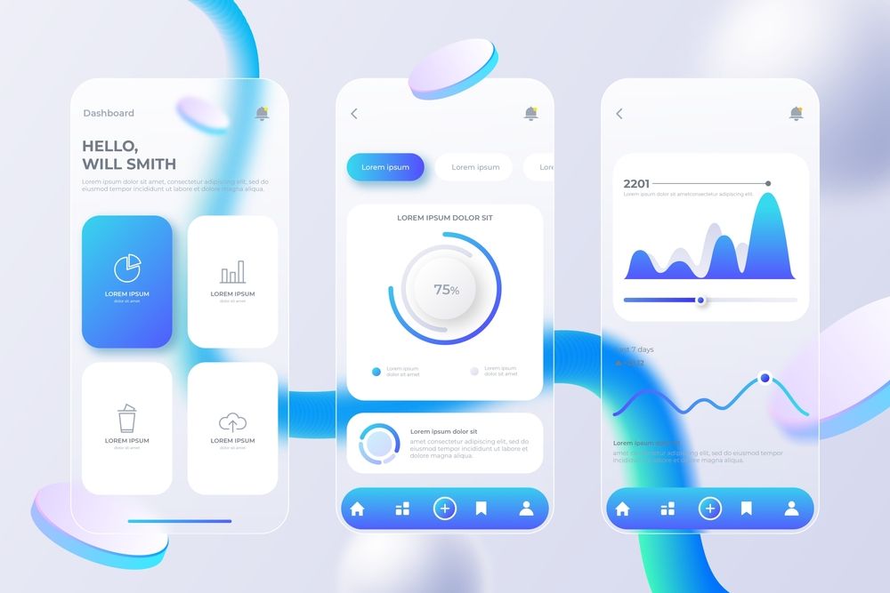
Glassmorphism: Style Meets Structure
Enter Glassmorphism—popularized by macOS Big Sur, Windows Fluent Design, and modern fintech UIs. This trend mimics the look of frosted glass: blurred background layers, transparency, vibrant highlights, and depth separation. Unlike Neumorphism’s subdued tone, Glassmorphism is more dynamic, making content feel layered and immersive.
Why It Works:
Glassmorphism manages to marry visual appeal with hierarchy. The blur effect introduces depth, helping users intuitively distinguish between interface layers without relying solely on borders or shadows. When used smartly, it enhances legibility and guides user attention—something Neumorphism rarely manages at scale.
In adaptive interfaces—like modals, pop-ups, and onboarding flows—it allows for a sleek separation between foreground and background. When paired with solid design systems (like Material Design or Apple’s HIG), it becomes not just a trend, but a viable design principle.
Its responsiveness across light/dark themes also adds to its versatility. It complements skeuomorphic textures and modern flat elements alike, making it easy to integrate into hybrid systems.
Digging Deeper: The Real Test Is in Functionality
Let’s get specific—what separates a short-lived aesthetic from a lasting design philosophy?
1. Accessibility and Usability
Neumorphism fundamentally struggles with WCAG guidelines due to poor contrast ratios. Even slight adjustments can break the visual illusion it relies on. On the other hand, Glassmorphism can maintain accessibility when combined with proper text contrast, color blocking, and focused layering.
2. Performance and Compatibility
Glassmorphism requires GPU-intensive blur and layering, especially on the web. While modern frameworks like React and SwiftUI make it more feasible, it’s still performance-heavy for older devices. That said, it’s more adaptable than Neumorphism, which often relies on raster-based designs and fixed light sources that don't respond well to system-level changes like dark mode or dynamic themes.
3. Design System Integration
Neumorphism struggles to fit into scalable design systems. It lacks a modular approach to states like hover, pressed, and disabled. Glassmorphism, however, can be layered on top of existing tokens, color schemes, and components, offering flexibility without overhauling the base system.
What's the Verdict?
Neumorphism: A Stylistic Muse, Not a Mainstay
It’s safe to say Neumorphism won’t disappear entirely—it will continue to inspire. In portfolios, brand experiments, and specialized UIs (like high-end IoT devices or ambient dashboards), it brings a sense of calm and craftsmanship. But as a primary UI philosophy? It fails where it matters most: accessibility, scalability, and clarity.
Glassmorphism: Trendy, But with Staying Power
While not perfect, Glassmorphism’s real strength lies in its adaptability. As screen technologies evolve—with high-refresh displays, spatial computing, and AR interfaces—this style’s use of depth and layering feels well-suited to the immersive future ahead.
Already, we’re seeing it mature. Designers are blending it with neobrutalism or soft UI elements, giving birth to hybrids that retain usability while embracing flair.
Final Thoughts: Trends Don’t Win—User Needs Do
Ultimately, design trends are tools, not rules. Neumorphism and Glassmorphism are reflections of what the design community is striving for—interfaces that feel intuitive, beautiful, and emotionally resonant. But any trend must answer to one metric: does it serve the user?
Glassmorphism checks more boxes: contrast, clarity, scalability, and integration with modern frameworks. Neumorphism, while visually poetic, remains more of an artistic expression than a practical design language.
So, which one is here to stay?
Glassmorphism—not as a trend, but as a foundation for the layered, ambient UIs of the future.