Responsive Design Pitfalls and How to Avoid Them
Introduction
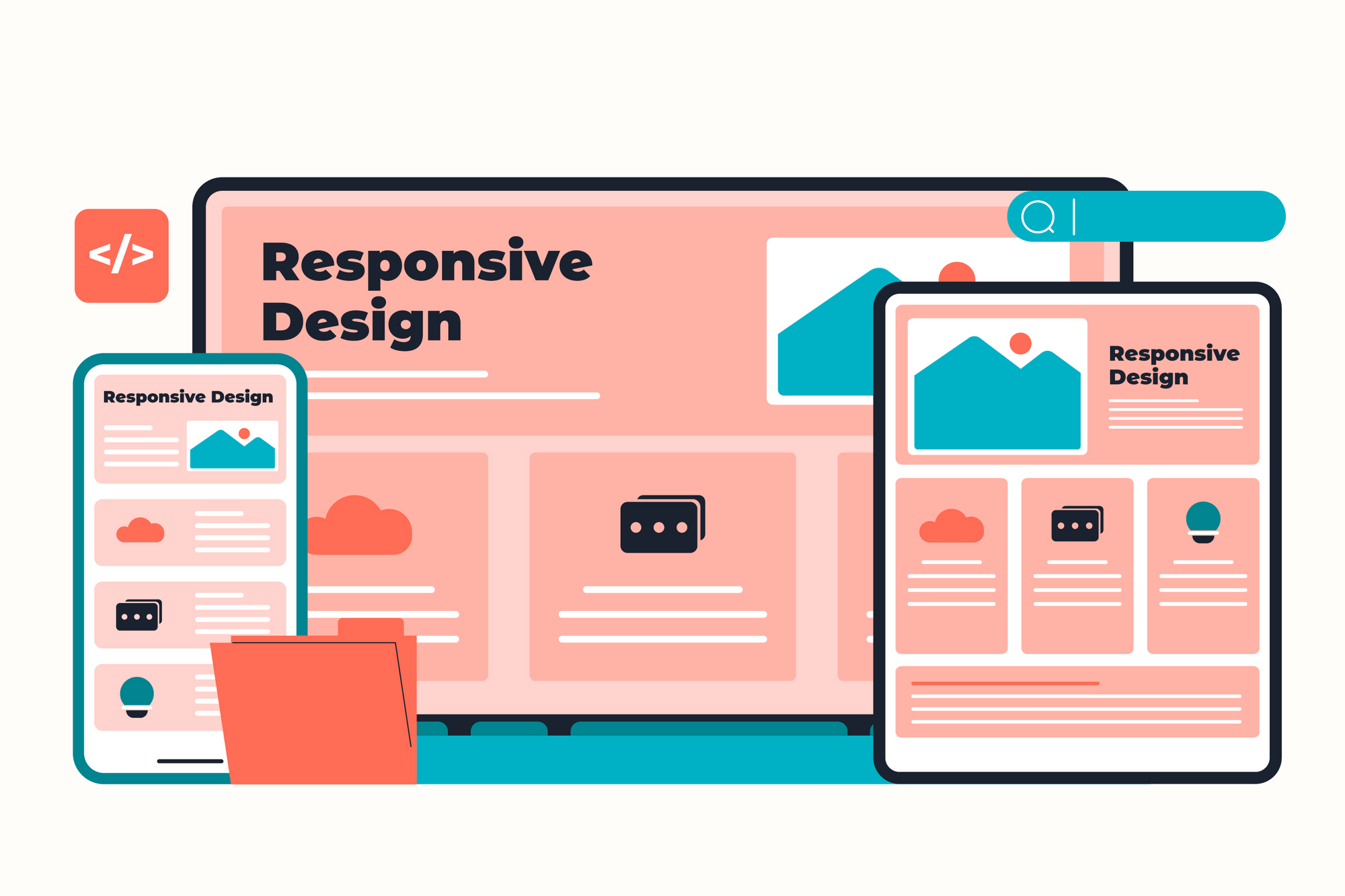
Responsive design is a cornerstone of modern UI/UX. It ensures that your product looks great and functions flawlessly across devices—from smartphones and tablets to laptops and desktops. Yet, despite its widespread adoption, many digital products still suffer from common responsive design mistakes that frustrate users and dilute the brand experience.
In this blog, we’ll explore the most frequent responsive design pitfalls and share actionable insights to avoid them—so your interfaces don’t just work on every screen, but shine.
What is Responsive Design?
Responsive design refers to the practice of building flexible layouts that adapt to different screen sizes and orientations. Unlike adaptive design, which uses fixed breakpoints, responsive design fluidly scales content using relative units, flexible grids, and media queries.
The goal: One design system that performs beautifully across all devices.
Common Responsive Design Pitfalls (And How to Avoid Them)
1. Ignoring Content Hierarchy Across Breakpoints
Responsive design isn’t just about fitting content on different screens—it’s about reprioritizing it. Failing to adapt content hierarchy leads to cluttered interfaces or critical content being hidden.
Avoid it by:
- Using mobile-first design to define essential content first
- Adjusting layout, font sizes, and spacing contextually
- Collapsing or hiding non-essential elements for smaller screens
2. Poor Touch Target Optimization
What works with a mouse doesn’t always work with fingers. Buttons and links that are too small or closely spaced can cause mis-taps.
Avoid it by:
- Following platform guidelines: 44x44px (iOS), 48x48dp (Android)
- Adding generous padding around interactive elements
- Testing UI with real users on touch devices
3. Unoptimized Images
Large, uncompressed images slow down mobile load times and consume bandwidth, while small images may appear blurry on high-res displays.
Avoid it by:
- Using
srcsetandsizesattributes to serve appropriate image resolutions - Implementing lazy loading for off-screen assets
- Compressing images with modern formats like WebP or AVIF
4. Breakpoints Based Only on Devices
Designing breakpoints based on popular devices (e.g., iPhone 13, iPad Pro) limits scalability and future-proofs nothing.
Avoid it by:
- Using content-based breakpoints (based on layout needs, not devices)
- Applying CSS media queries thoughtfully (e.g.,
min-width,max-width) - Testing across a spectrum of screen sizes—not just a few models
5. Inconsistent Navigation UI
Your navigation must adapt to screen size without losing discoverability. Hamburger menus, off-canvas nav, or hidden nav on small screens often frustrate users.
Avoid it by:
- Keeping primary navigation elements always accessible
- Using expandable menus, tabs, or bottom nav bars where appropriate
- Prioritizing usability over minimalism
6. Overuse of Fixed-Width Elements
Elements with fixed pixel dimensions break layouts on smaller or larger screens.
Avoid it by:
- Using relative units (%, em, rem, vw/vh) instead of fixed pixels
- Embracing CSS flexbox and grid for flexible layout structures
- Testing text and images for fluid resizing
7. No Typography Scaling
Static font sizes cause text to look oversized on small screens or tiny on large displays. Readability suffers.
Avoid it by:
- Using responsive typography (e.g., clamp(), media queries)
- Establishing a fluid type scale
- Allowing line height and paragraph spacing to adapt
8. Forgetting Landscape Orientation
Designs optimized for portrait often break or feel awkward in landscape mode—especially on tablets.
Avoid it by:
- Testing layouts in both orientations
- Avoiding over-reliance on vertical scrolling only
- Supporting reflowing or rearranging of columns and grids
9. Overcomplicated Media Queries
Too many media queries lead to bloated, unmanageable CSS and unpredictable behavior.
Avoid it by:
- Defining a clear set of breakpoints (3–5 typically suffice)
- Using utility classes and mobile-first CSS
- Organizing styles with pre/post-processor tools (SASS, PostCSS)
10. Lack of Real-World Testing
Desktop-only design reviews or using emulators exclusively can miss real device nuances like notch interference, keyboard overlaps, or gesture bars.
Avoid it by:
- Testing on actual devices across different OS and screen sizes
- Simulating touch and scroll behavior in tools like Chrome DevTools
- Observing user interaction in the wild
Bonus: Design Responsively from the Ground Up
Responsive issues usually arise from treating mobile as an afterthought. Instead, start with mobile-first principles:
- Begin with the smallest screen first
- Scale up and add enhancements (progressive enhancement)
- Use a responsive design system or component library (like Bootstrap, Tailwind)
Mobile-first doesn’t mean mobile-only—it means making sure essentials always work.
Tools and Techniques That Help
- Figma & Sketch: Use constraints and responsive resizing
- Browser DevTools: Live test responsiveness and debug
- Responsively App / Polypane: Preview designs across multiple screens
- Chrome Lighthouse: Audit for performance and mobile usability
Conclusion
Responsive design is no longer optional—it’s a foundational UX expectation. However, designing responsively doesn’t mean simply scaling down content; it’s about restructuring, reordering, and rethinking the user journey across devices.
By avoiding these common pitfalls and implementing best practices, you ensure that your digital product feels delightful and functional, no matter where or how your users access it.