The Psychology Behind Great UI: How Human Behavior Shapes Design
Introduction
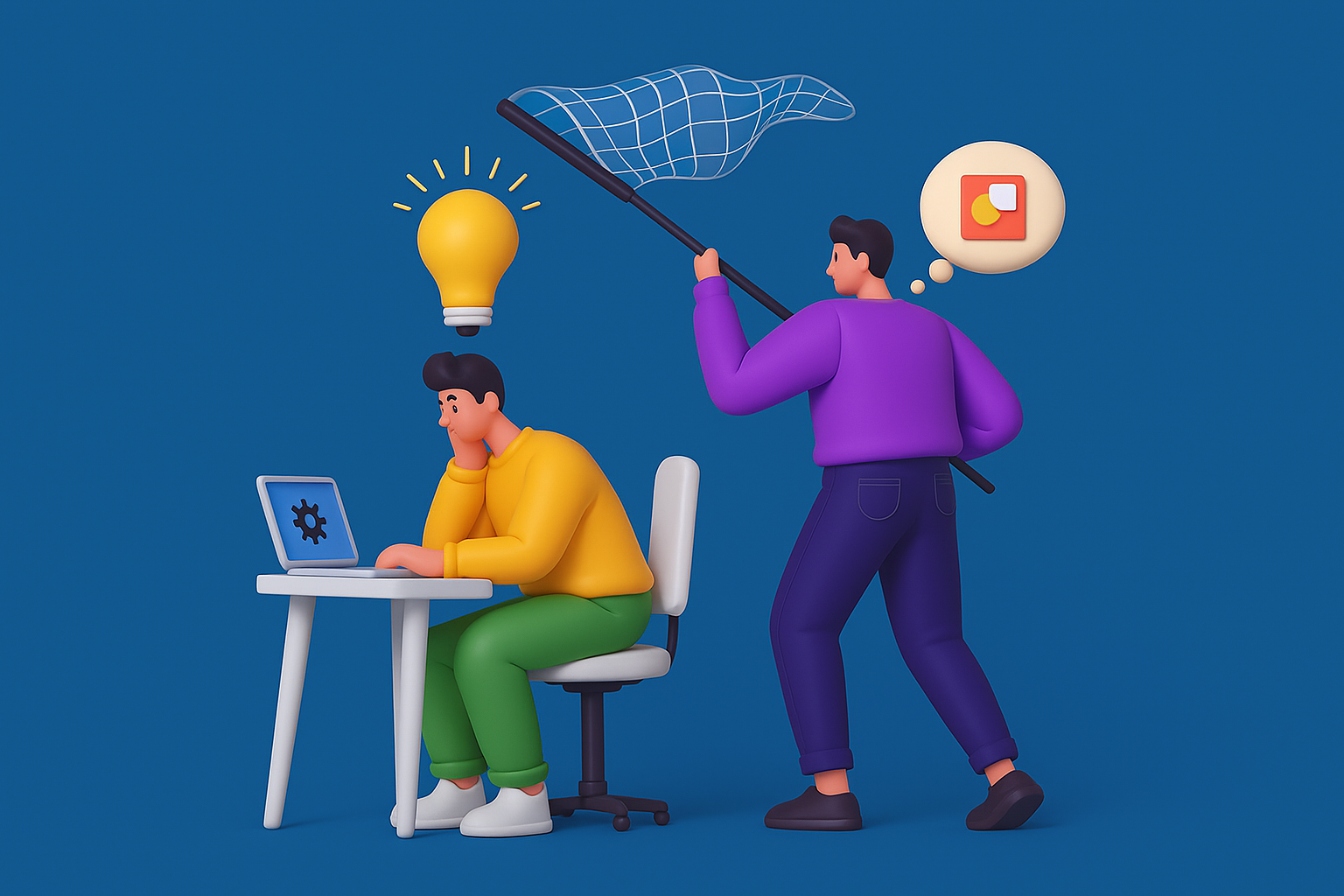
At its core, great UI design isn't just about aesthetics—it's about understanding human behavior. To create interfaces that feel intuitive, designers must tap into psychology, decoding how users think, feel, and act. When UI design aligns with human behavior, it reduces cognitive friction, builds trust, and boosts engagement.
This blog explores the psychological principles that shape successful UI design and how designers can apply them to craft more meaningful, user-friendly digital experiences.
Why Psychology Matters in UI Design
Design is communication. Every color, icon, or layout decision influences how users perceive and interact with your product. By leveraging behavioral psychology, designers can:
- Predict user expectations
- Minimize confusion and decision fatigue
- Increase user satisfaction and retention
Whether you're building a mobile app or a web dashboard, psychological principles guide users toward desired actions with less resistance.
Key Psychological Principles in UI Design
1. Hick’s Law: Simplify Choices
What it says: The time it takes for a user to make a decision increases with the number and complexity of choices.
Design Tip: Limit the number of options on a screen. Use progressive disclosure to reveal complexity only when needed.
Example: Google’s homepage features a single search bar, avoiding distractions to help users focus.
2. Fitts’s Law: Optimize Target Size and Distance
What it says: The time to interact with an object is a function of its size and distance from the user’s starting point.
Design Tip: Place frequently used elements (like CTAs) in easily reachable areas and make them large enough to tap or click comfortably.
Example: Mobile apps place navigation buttons at the bottom of the screen—within thumb reach.
3. Gestalt Principles: Visual Grouping
What it says: People perceive visual elements as organized patterns or groups.
Design Tip: Use proximity, similarity, continuity, and closure to guide the user’s eye and create visual hierarchy.
Example: Form labels grouped closely with input fields improve readability and reduce input errors.
4. Miller’s Law: Chunk Information
What it says: The average person can hold 7 ± 2 items in their working memory.
Design Tip: Break complex information into smaller, digestible chunks. Use lists, steps, or tabs.
Example: Onboarding flows that use step-by-step screens instead of one long form improve task completion.
5. The Serial Position Effect
What it says: People tend to remember the first and last items in a series best (primacy and recency effects).
Design Tip: Place key actions or content at the beginning or end of a list/menu to boost visibility.
Example: Important links like “Home” or “Log Out” are typically placed at the top or bottom of navigation menus.
6. Cognitive Load Theory
What it says: Too much information or too many tasks overwhelm the user’s mental capacity.
Design Tip: Prioritize clarity. Minimize distractions, use whitespace strategically, and guide users one step at a time.
Example: Clean dashboards with focused KPIs help users digest critical information quickly.
7. Von Restorff Effect (Isolation Effect)
What it says: When multiple similar items are present, the one that differs is more likely to be remembered.
Design Tip: Highlight important actions or information using contrast in color, size, or shape.
Example: A brightly colored “Sign Up” button on a neutral background stands out and attracts clicks.
8. Aesthetic-Usability Effect
What it says: Users perceive aesthetically pleasing designs as easier to use—even if they aren’t more functional.
Design Tip: Don’t just focus on usability—make it look good too. Visually appealing UIs improve perception and tolerance for minor usability flaws.
Example: Apple products are known for their clean, minimal designs that elevate the perceived value and usability.
Practical Applications of Psychology in UI
1. Use Familiar Patterns
Familiarity reduces the learning curve. Follow established design conventions (like hamburger menus or icons) to meet user expectations.
2.Leverage Color Psychology
Colors evoke emotions and influence behavior. Blue is often associated with trust, red with urgency, green with success.
3. Guide with Visual Cues
Use arrows, animations, and contrasts to guide attention. These cues act like subtle instructions without adding clutter.
4. Personalization Matters
People respond positively to personalized experiences. Tailor content and UI based on user behavior, preferences, or location.
Real-World Examples
Spotify
Uses chunking (playlists, genres), color contrast, and clear CTAs to reduce cognitive load and enhance discovery.
Airbnb
Leverages aesthetic appeal, whitespace, and structured layouts to simplify booking experiences.
Duolingo
Applies gamification psychology, positive reinforcement, and bite-sized tasks to make language learning engaging.
Conclusion
Understanding how users think is the key to designing interfaces that truly resonate. By integrating psychological principles into UI design, you create products that feel natural, engaging, and easy to use.
Great UI isn't just seen—it’s felt. And that feeling comes from designing with the human mind in mind.